For over 10 years, Trade Area Systems has been building technology to provide companies with access to all the relevant data they need to make smarter retail real estate decisions. With a set of powerful tools, TAS helps accelerate their customers’ retail site selection process and leasing decisions, bringing them future growth. After over a decade of success, it was time to evolve the TAS branding and website for a modernized look and feel, with a greater focus on educating site visitors on how TAS works.
A Branding Evolution
While the branding felt dated, it had grown recognition among TAS’ partners, clientele and prospects over the past 10 years. Our focus for the branding evolution was to refresh the TAS logo with refined typography and an updated logomark that didn’t deviate too far from the previous mark. In conjunction with the branding evolution, we helped the TAS team streamline their product messaging and define a brand strategy that better reflects their target audience of large retail organizations.

A Marketing Website Reimagined
The primary goal of the website redesign was to present TAS as the industry leader in retail real estate site selection technology. To achieve this, two major components had to be considered:
- Fine tuning the voice and tone used throughout the website to better reflect the newly established brand strategy while updating content to concisely depict the power behind the TAS approach. With our guidance and direction informed by the overall site design, the TAS team diligently worked to refine content for quicker, direct messaging that positioned TAS as an expert in the field. Using WordPress as our platform of choice, managing this content and making updates on the fly was a simple task.
- With minimal visual assets to work from, a large focus of our design process was creating a solid visual language that didn’t rely on stock photos. We created a library of simple iconography and graphics that effectively communicated the tools, applications and data behind the TAS platform. Color and angular elements, combined with map visuals, directly reflect the new brandmark for a consistent visual strategy to be carried beyond the website to other marketing collateral.
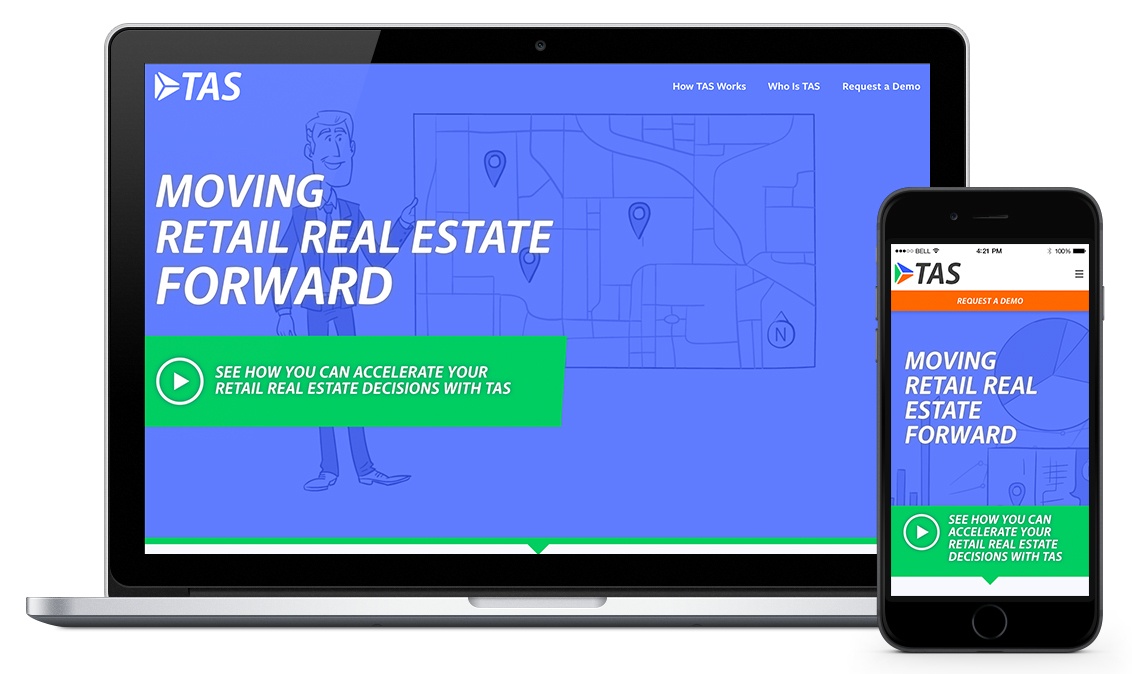
The new TAS homepage features video integration to lure site visitors in and educate them about the benefits of the TAS platform.

Simple, clean graphics and iconography create a consistent visual strategy while communicating the components of the TAS platform.
A New Business Strategy
Aside from the visual and content strategies of the website, the TAS team was looking to shift their marketing efforts to focus on an account based strategy. Backed by a strong sales team, TAS was ready to directly target specific industries and companies, but their previous website didn’t offer any support. We collaboratively structured an ABM solution that would bring assets, documents and additional prospect information online for a seamless communication and sales process that presents TAS as the experts they are.
Check out the new TAS branding and website to learn more about their advanced platform.