Why Typography Matters: Drama at the Oscars

The card needed to be written and designed in a way that makes it clear to the reader only the essential information.
Source: Why Typography Matters — Especially At The Oscars
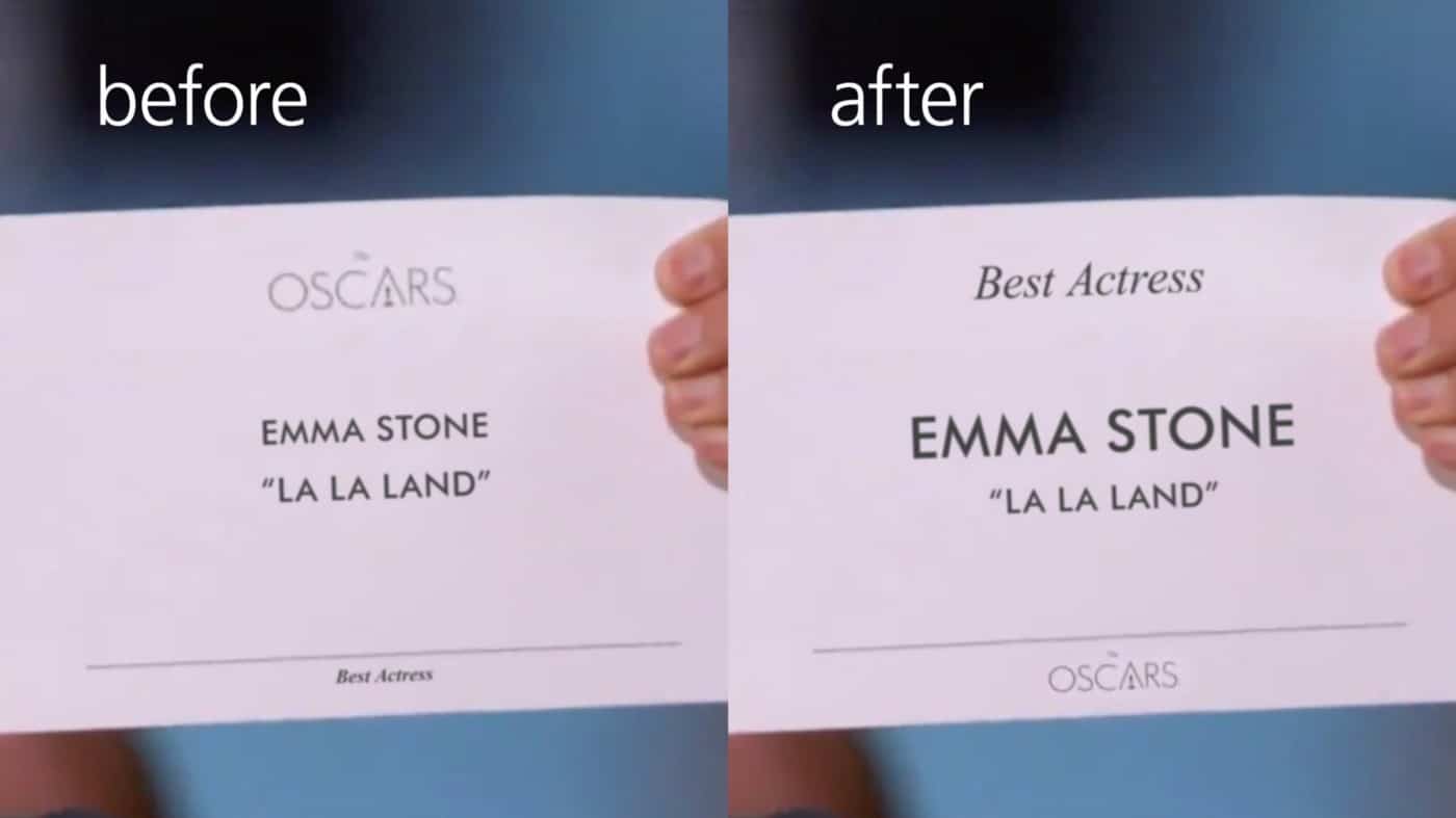
You may have heard about the (major) snafu at the end of the 2017 Academy Awards where the wrong winner was announced, not just for any award but perhaps the most anticipated award – Best Picture. Sure, it may have been human error; grabbing the incorrect envelope (in the dark backstage wing) and handing it over to the presenters without realizing any mistake until it was too late. Or maybe something as simple as clear, legible typography would have prevented the mishap.

Mary Beth Amaral

With a keen eye for detail, Mary Beth dreams of a pixel perfect world. After graduating summa cum laude from the University of Massachusetts Dartmouth with a BFA in Graphic Design and a minor in Art History, Mary Beth’s love of learning sent her back to her alma mater where she further explored her passion for information architecture and user experience, earning a degree in Web & Interactive Design.

| @maryelizabeth55